
It’s safe to say that we encounter dozens, if not hundreds, of logos per day. Most of these are through advertisements and are in placements that our subconscious minds take into account without us realizing it. Brand identity can be a powerful tool to market an organization—when done strategically.
It’s a common misunderstanding when designers say that a logo is your brand. That is, well, only partially true. A brand is a company’s overall image, reputation, and perception in the eyes of consumers. What we’re going to be talking about in this article is an element of a brand identity, which is a subsection of a brand.
A brand identity refers to the visual and physical elements that are used to communicate the company’s values, personality and message. It’s represented through the company logo, colors, typography, imagery and other design elements. All this design information is gathered into a brand style guide, a rule book for how to use the brand identity pieces within certain contexts.
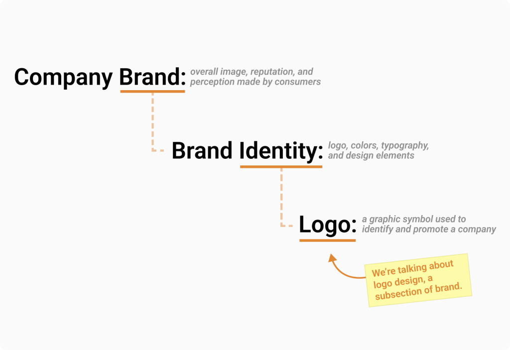
I think it’s important to understand the hierarchy of all the “branding words” so you can strategize and design accordingly. So now that we have some terminology cleared up, let’s focus in on what factors make for a great logo design, which is the most important piece within a brand identity.
For the purposes of this article, I’m going to put the BrandRoots logo in the hot seat. So, let’s pick it apart and see what design features we find! So, what makes a great logo?
It’s Simple
You can usually tell an amateur designer from a professional one just by looking at their logo design work. Logo work that is cluttered with weight and unnecessary design elements don’t visually look good or work well in the real world. The more experienced a designer is in connection with how observational they are, the more often they ask themselves during the design process, “What elements can I remove?” instead of “What elements can I add?” Simple design is going to win every time over complexity because it’s easier to work with.
“I prefer simple logos because you can do complicated things with them. Keep it simple. Make it smart.”
Paula Scher
Simple design looks like:
- Using one font, two at the very most if unavoidable.
- Using no more than a few colors.
- Having a symbol that is built with such simple shapes that it can be stitched small onto a t-shirt in one color and still be recognizable (I call it the stitch test).
- Avoiding use of gradients or drop shadows that can cause inconsistency in presentation (doesn’t pass the stitch test here).
- Something you can make a literal stencil out of and guarantees a clean output each time it’s traced (the stencil test).
- Avoiding unnecessary lines or design elements that don’t emphasize meaning or improve readability.
Secondly, a simple design is going to age well.
Designers that follow trends will find that their logos will need to be revisited again in a few years. Every company generally goes through phases of rebrands, but recreating a new logo is an expensive change to make and something company’s should want to avoid doing frequently. When a logo uses simple shapes and lines the presentation is going to look clean and very intentional; therefore, it’s going to age well too.
Let’s look at a wild metaphor for this. Let’s say we have two people that are 60 years old:
- Person 1: has had a life of hardship and carries a weight of stress and worry
- Person 2: has had a pretty easy life without much weight or worry at all
Though they’re both the same age, who do you think looks older? The first person likely looks much older because of all the weight they carry in stresses. The second person has likely aged gracefully because they weren’t carrying as much.
In the context of design—The logo with less weight on it (less usage of unnecessary design elements) will age more gracefully. Simple designs tend to look timeless. Less is always more. Perhaps a far stretch metaphor here, but it’s just how my mind works; and I hope it helps you remember the concept!
It has Meaning
There are a lot of logos with secret meanings. This doesn’t mean that it’s a logo design requirement; however, you want your logo to be a good representation of the company. Can you identify the meaning in the following logo examples of popular companies?
Let’s look at this completely fictional logo below that is poorly designed in so many ways to represent “The Happy Company.”

Anyone would be able to identify that this is a poor design because the meaning of the logo is not a good representation of the name of the company. A sad blue face and creepy vibe font is total opposite of the word “happy.” I know this example is extreme; but trust me, there are logos out there needing our design help just like this one!
When it comes to our BrandRoots example, the symbol has lines that shape into a tree (representative of roots) and an arrow (representative of leveling up your skills). I also wanted repeating lines within a circle shape to represent something like tree rings. Much like how tree rings appear as a tree ages, these rings of skills grow as you age with experience too. Do I expect the audience to know these details or see it important that they do? No. But it has meaning for the company, and it doesn’t pose a conflict if the consumer doesn’t directly know these details. There’s a balance, and you the designer need to know the fit.
It Scales Easily
It’s critical that a logo can scale in different sizes. Whether you place a logo on paper, fabrics, t-shirts, swag, digital presentations, social media…every context you can think of, the size of the logo will always be slightly different. You want to ensure that your logo looks good at any size.
I won’t go into the details about file formatting and image types in this article, but I will say that a logo needs a file to be created with outlines. In other words, your logo should be created in vector, or line shapes. Most illustrator programs have an “outline stroke” option.
As with the example below, when I have my logo create outlines, it converts each letter as its own individual shape. Outlines cut your logo up into the smallest pieces possible. This ensures that no matter the size you scale it at the image quality will stay high. This is because vector art uses math to calculate precise sizes of each pixel. Non-vector art can expand in size, but its image quality will become blurry.
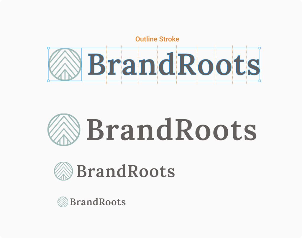
So often I see clients send me logos that are of a photographic quality file type, and this always produces a low quality presentation. It’s not uncommon for me to recreate the logo into vector format just to use for a project. Don’t be that designer. Ensure you’re using the right file types. Other designers will be grateful you did.
It Works in Black and White
A good logo should be good at its full color as well as black and white. Logos should avoid using gradients and shadowing which can make it too complex and can cause presentation issues.
It’s common to see black and white version of logos be used for swag such as pens or coffee cups. Sometimes it’s cheaper to print in black and white on t-shirts or flyer handouts at the office instead of a printing press. Going back to keeping with simple design, a good logo should work just as well at its simplest color form of solid black and white.
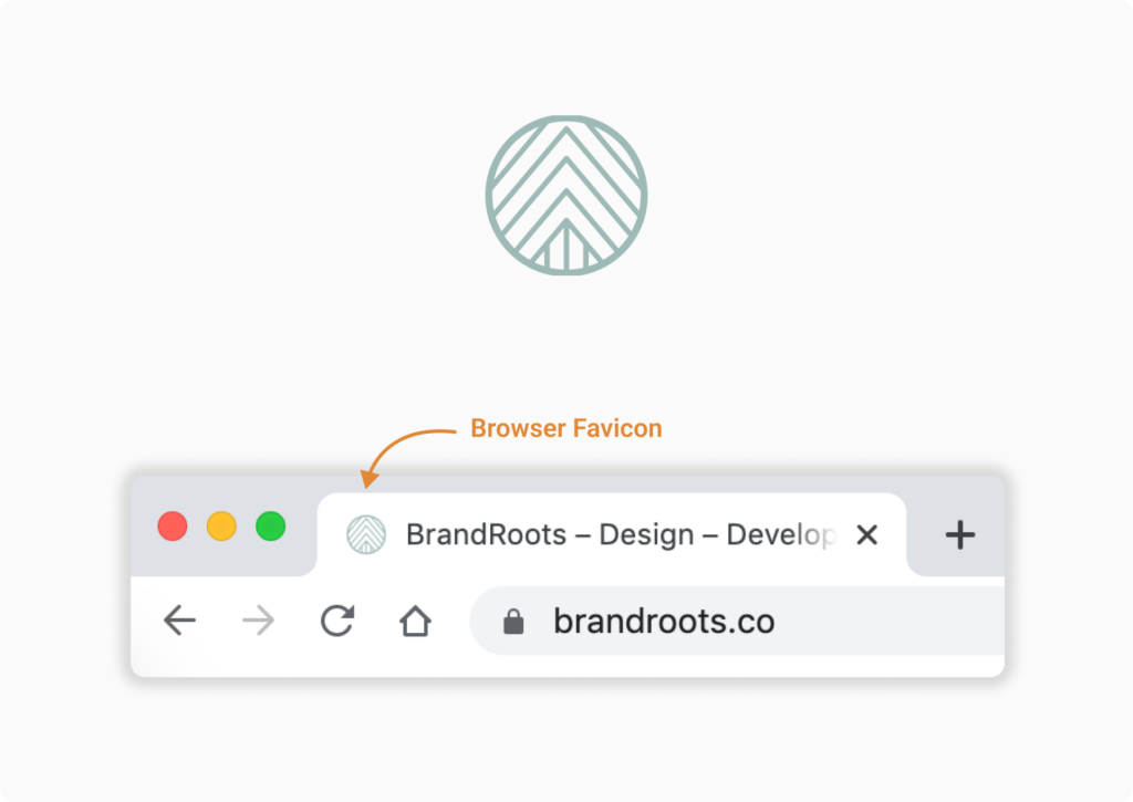
The Symbol and Text Can Separate
One thing that is going to extend the life of your logo design is by having it be flexible in stack and in pieces. Flexibility starts with the ability to separate the logo symbol from the logo text. With this separation, you now have access to use the symbol in places where icons really shine, such as:
- A website favicon
- Social media profile photos
- A profile photo associated with an email address and phone contact
- A mobile app icon
- Avatar icons for online communities
Allowing the logo symbol to rest at the side of the logo text or above it also provides flexibility for when you may need logo placement in a portrait or landscape view.
It’s totally common for a person to have dozens of windows open within their browser at a time. Don’t have your website get lost in the mix. Use your logo symbol to create a favicon, that little graphic in the browser tab next to your website title name.
You’ll notice that I use just the symbol for my social media profiles. The social media platforms put the company name next to the icon, so there’s no need to repeat this. By just using the symbol, we can get a closer look and not strain our eyes trying to fit a logo symbol and text in the profile photo.
A company may not be using social media or making a mobile app, but design a logo that is prepared for the next profile usage. Be ready for the next technology platform. Brand style guides are good, but don’t be so rigid in the usage rules that you are hindering the growth of your brand identity.
In Conclusion
If I were to summarize all the factors, I would note two points:
- Have flexibility. Design to grow, not to get stuck.
- Ask yourself of the design, “What can I remove?” instead of “What can I add?”
This is a very broad look into what makes a great logo. There can be so many branches of topics to further expand into, but I hope this article shares some starter tips to help you think strategically when designing your next logo!